
Since 1978, DAT has provided load matching services to the trucking industry. Today it is the largest load board and a well-respected source on industry data.
The Trendlines part of their site provides free, although limited insight on the direction of rates, fuel costs, and freight capacity over time. The intent is to interest brokers in a more robust data subscription. We’ve been working to improve the stickiness of the site and likelihood that a visitor would inquire for more information.
Here’s a summary view of progressive steps toward a final solution; from early sketches and ideas to final visual asset development. The site initially looked like this:
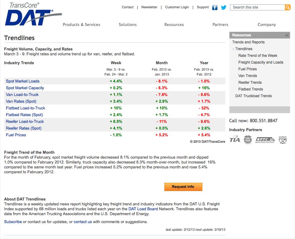
The site was initially multiple pages and tabular data. We believe that using visuals as buttons and navigational aids would be more inviting to a visitor. We also wanted to create the impression of a user-directed tool for content exploration. Several alternative sketches were developed to show how the site might evolve.
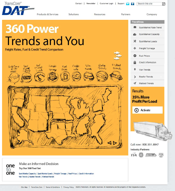
Colors were set according to the three equipment types. Icons were developed for each along with other site components like fuel and geographic region. We continually explored and tightened up the layout to meet various requirements for advertising display, calls to action, and dynamic charting of information on the page as selections are made.
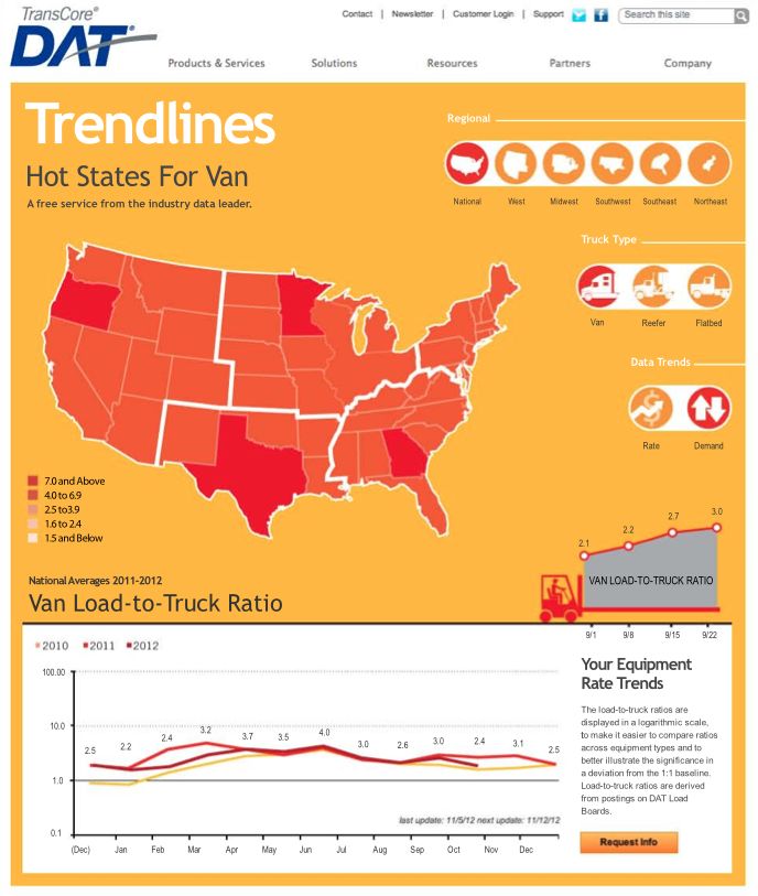
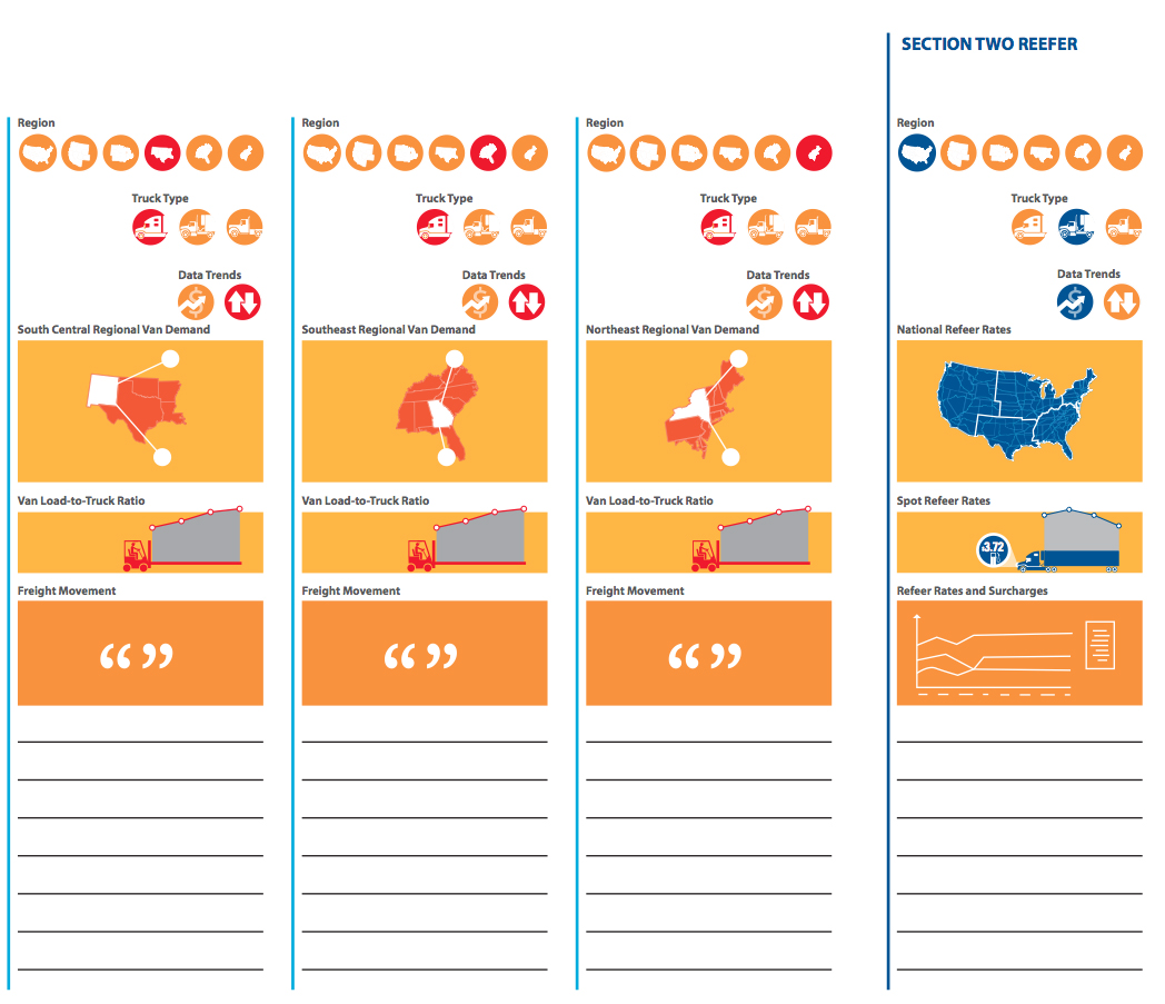
Here are a few more examples of the icons and pieces developed for the sites relaunch. We also provided content mapping pages to clarify for writers how many different states would be available to visitors by choosing various button combinations.
We’re looking forward to the imminent launch of the new site and reporting back on progress toward generating more industry excitement and inquiries.