I’ve recently had the privilege of helping a former employer, Accenture, in developing new presentations to support a complex software product for utilities. The software integrates, manages, and visually displays data from Smart Grid operations to inform intelligent decisions. This project provides a great example of how to redevelop a deck with a focus on user understanding and benefits. Some of Accenture’s utility clients are overseas, so visuals are extra useful in transcending language barriers quickly.
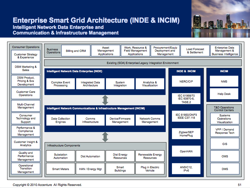
Many slides were produced that look like the example at left below. The addition of points, boxes, and copy had confused the speaker’s key points.
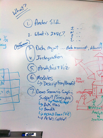
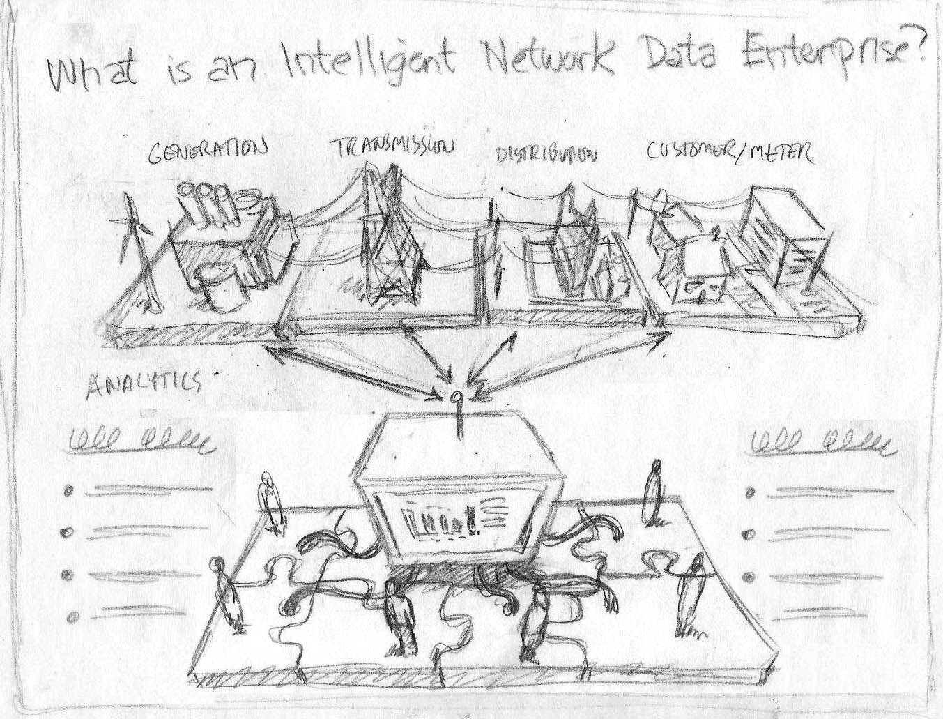
Our first step was to spend time understanding the challenges utility audiences face managing massive smart grid data, and how the software delivers a valuable solution. Early sketches explored different ways to make the point.
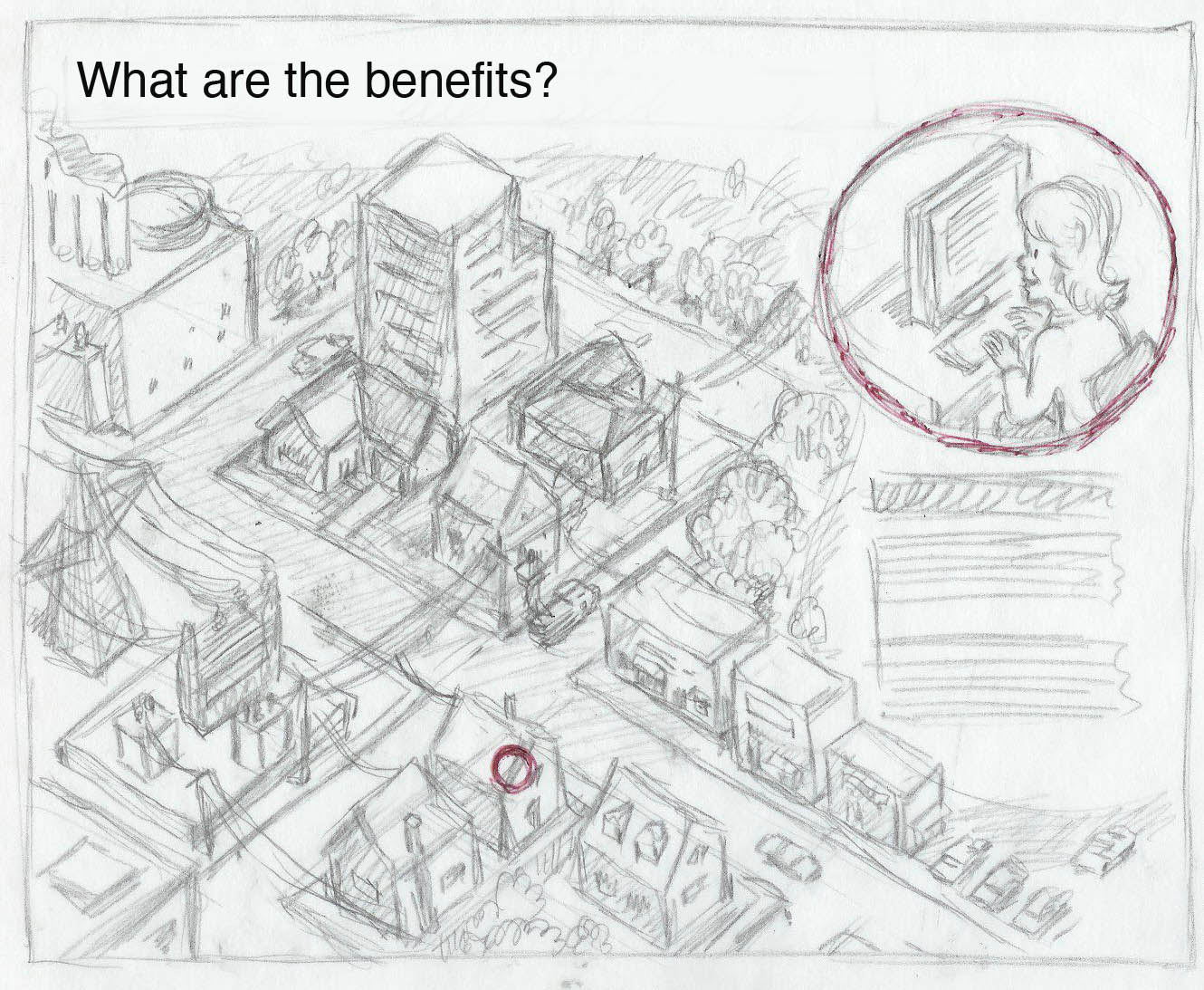
The neighborhood scene above, while interesting, was too complicated for easy navigation and interpretation. We narrowed our focus on several key target groups as represented by the platforms along the top.

Additional exploration led to a conclusion that “massive data’ represents both a significant risk and opportunity for utilities. If uncontrolled, massive data growth will overwhelm existing systems without delivering any actionable insight. Accenture’s software solution will integrate, manage, and visually serve massive data to support intelligent decision making.
The final overview presentation appears conceptually simple. That’s always a good goal: get things into a form that is instantly recognizable.
“Mark helped us take a complex topic and represent the essence of our message in simple pictures. Colleagues told me it was the best presentation on this topic they have seen. Even more importantly, our new presentation package has helped us get the desired results with clients.”
~ John Schullian | Accenture Software
We also created a media asset library of schematic pieces that could be used in the communication of new ideas and particularly case stories. A flattened, schematic representation also fit better with the rigorous identity standards Accenture requires.

A good story has a beginning, middle, and an end. Or in marketing terms, a story should establish a need, features, and solution benefits. How do we get started?
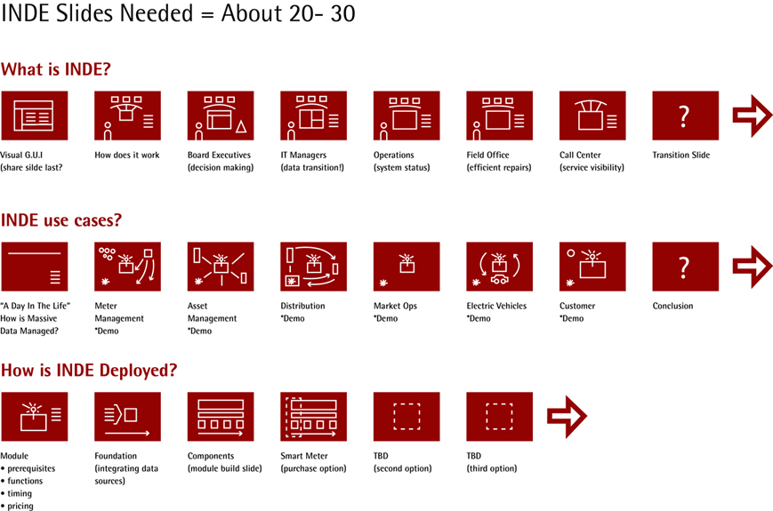
A storyboard of sorts was created to highlight the various solution parts that would be needed to tell the whole story.