Visitors to our site describe the before-and-after examples as most beneficial in understanding the value we bring. Everything a company does from proposals to product delivery should convey professionalism and personality.
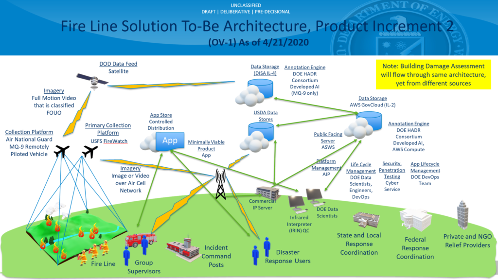
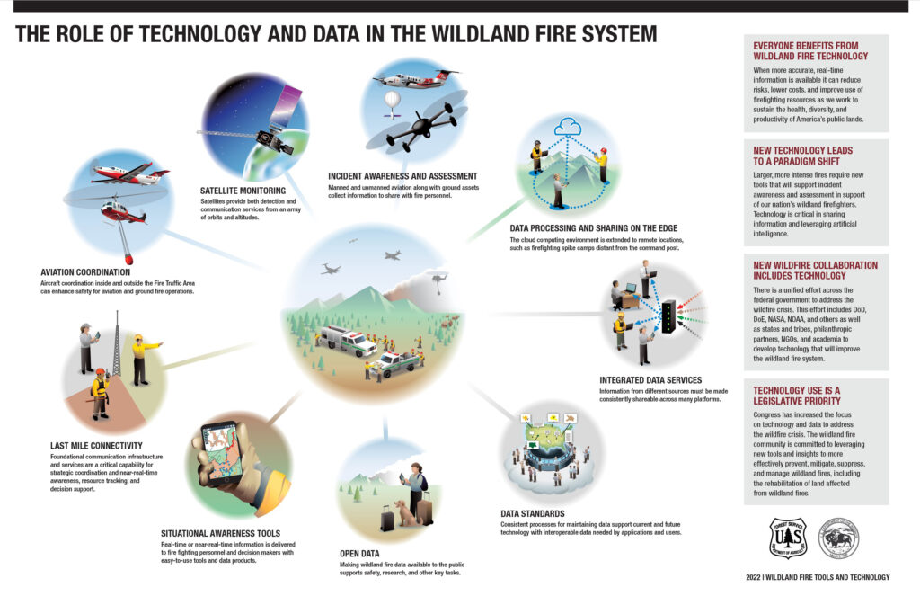
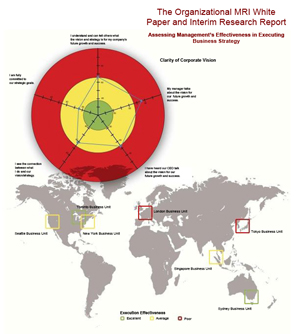
US Government technology report
A report to the president and congress highlighted the integrated nature of wildland fire technology. Major investments depend on a clear understanding of underlying value shown here.
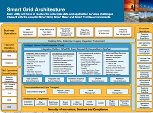
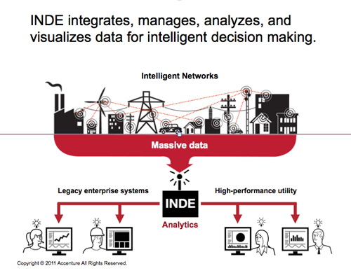
Accenture Smart Grid software PPT
We redeveloped a lengthy presentation that describes how software enables utility networks to manage massive quantities of data. The project required interpreting software process solutions and summarizing clearly with iconic visuals. Use cases were also developed.
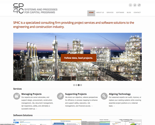
SP4C website
A group of senior engineers who provide consulting support to capital projects asked us to rewrite, redesign, and relaunch their website to more clearly position their service benefits.
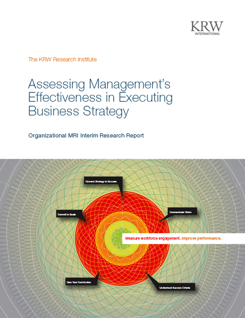
KRW proposals and reports
Your collateral system includes templates used every day for client correspondences; proposals, letters, invoices, reports and more. Everything should be easy for your employees to use and consistently professional in appearance to build a strong brand identity.
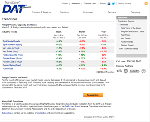
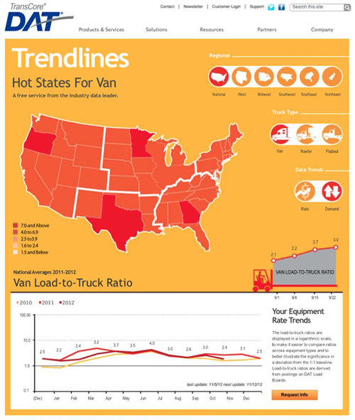
DAT Solutions Trendlines site
We can help your team of programmers develop user interfaces that are easier to follow and more engaging. The goal should be completing tasks with no confusion or frustration.
ITIL Visual Aids
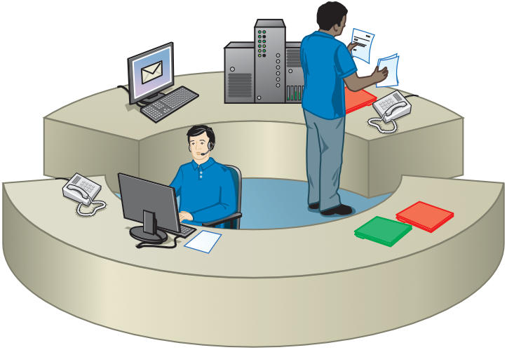
Information Technology Infrastructure Library demonstrates how an IT service desk functions. LEARN MORE
